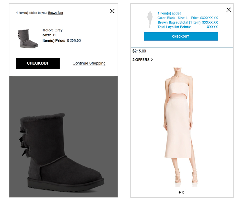
A/B testing of the mobile add to bag. The customer problem: the mobile bag was too complicated and the information was not scanable making it hard for the customer to understand what they added to their bag. We ran an A/B test on the bag to prove what was the best solution for the customer.
As a result, the simplified bag won and increased conversion.
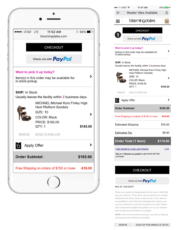
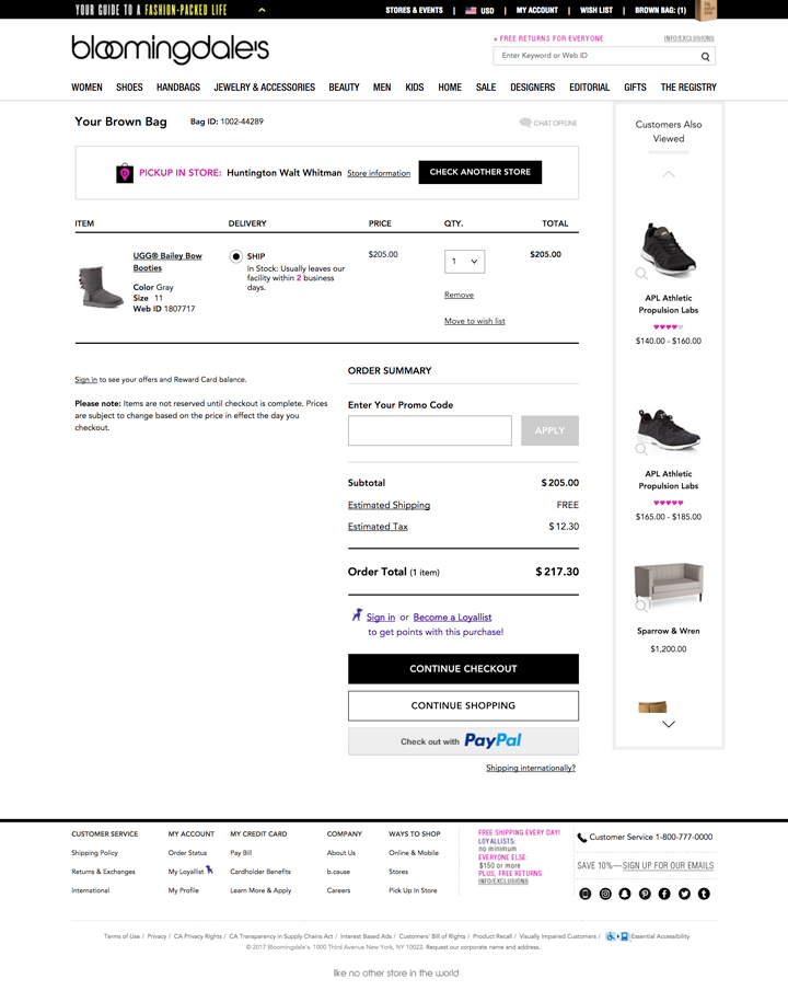
A/B tested the checkout buttons on the top of the mobile bag. Customer Problem: the checkout buttons were hidden at the bottom of the bag making it a longer process for the customer to checkout. We tested another set of buttons at the top of the bag. Although the results were positive, we opted to redesign the bag.
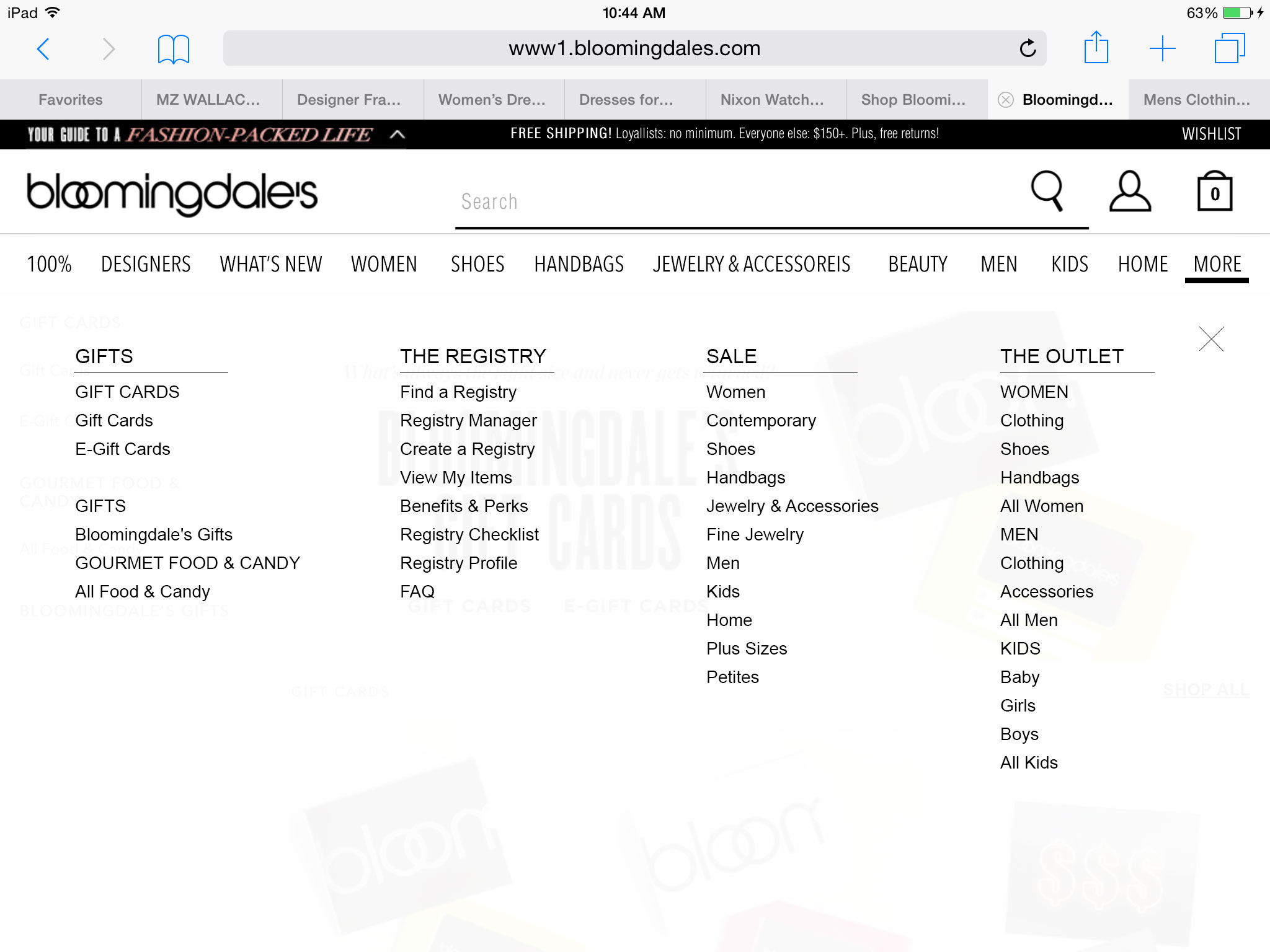
Customers are not aware the tablet navigation swipes making it difficult to get to the other categories (Registry, The Outlet, & Sale). A proposed solve was to add a "more" button to include the additional main categories in the top header. There was an additional issue with the input field for the search. When a customer would type in the search bar, the search bar would disappear. This is a result of an iOS bug. The proposed recommendation was to make the search be in a full screen modal to prevent the disappearing input field.